
Technical Terms of the "Black Art"
From Abklatsch to Zwiebelfisch
Abklatsch — a pull or offset — transferring an outline layout onto a printing surface in order to work up a colour scheme.
Affiche — (French: placard) a poster or bill, usually printed on thin white or coloured poster paper (Affichenpapier).
Alfapapier — esparto paper — a soft, thick-feeling, good printable paper.
Atlaspapier — satin ("atlas") paper, similar to ice paper; its surface feels like satin silk to the touch.
Ausbringen — deliberately spacing the composition out ("running out") to reach a particular number of lines or pages (the opposite of Einbringen).
Ausrücken — setting words outside the type area at various points in the margin = marginalia.
Ausschlachten — "stripping" — removing rules and spacing material from existing composition (the plain text setting is left standing).
Auszeichnen — to emphasise parts of the text by l e t t e r s p a c i n g and the like.
Bastardschriften — bastard types — letterforms lying between the character of Fraktur and roman (Antiqua), and of other typefaces too.
Blankschlagen — filling out gaps in the forme — where images or portions of type are still missing — with spacing material.
Blockade — letters turned upside down, used to mark illegible or doubtful passages in the manuscript.
Borgis — 9-point type size (English: bourgeois).
Büttenpapier — handmade (mould-made) paper with no defined grain direction.
Cicero — 12-point type size (the Continental pica).
Colonel — 7-point type size (English: minion).
Corps — designation of the body and shank of a type, given together with its point size.
Diamant — 4-point type size (English: diamond).
Duodez — duodecimo — a small book format of 12 leaves to a printed sheet.
Durchschießen — to lead — inserting leading between the lines of solid-set (unleaded) composition.
Durchschuß — leading — the filling material placed between lines.
Einbringen — to "take in" — compressing the composition into a given space.
Einziehen — indenting — setting opening lines or paragraphs in from the left margin.
Fahnenabzug — galley proof — the first hand pull of the composition, taken for correction.
Faksimile — facsimile — an absolutely faithful reproduction of an original text or drawing, e.g. manuscripts.
Fische — "fish" — letters from another fount that have crept into the composition by mistake.
Flattermarke — collating mark (back mark) — a mark placed in the spine fold, stepped progressively lower from sheet to sheet between the first and last page, used to check the gathering of the sheets.
Fliegenkopf — "fly's head" — a letter standing upside down in the composition.
Fleisch — the shoulder — the parts of the type body surrounding the printing face.
Frosch — the movable part (the knee) of the composing stick.
Gemeine — the lower-case letters of the alphabet (also called minuscules), as opposed to Versalien = capitals.
Gespan — the colleague working with the compositor in the same "alley" — the gap between two rows of type racks.
Hering — "herring" — a printer's term for a reprimand, telling-off or rebuke.
Hochzeit — "wedding" — words or portions of text accidentally set twice (a doublet).
Hurenkind — widow — a short closing line appearing as the first line of a page.
Imprimatur — the authorisation to print ("let it be printed").
Index — table of contents or register/index.
Inkunabeln — incunabula — cradle prints (the earliest printed books).
Insertio — a 6½-point type size still used occasionally in the setting of advertisements.
Jungfer — "maiden" — a page or column set by the compositor without a single error.
Kanon — a type size of 36 point = 3 cicero in body size (English: two-line great primer / canon).
Kapitälchen — small capitals — capital letters cut to the size of the lower-case letters.
Kolumnenschnur — page cord — the cord used to tie up and secure a page of standing type.
Konus — the cone — the upper part of a type, tapering outward toward the bottom, which carries the printing face.
Korpus — 10-point type size (English: long primer).
Kornätzung — grain etching — a halftone in which the breaking-up of the mid-tones was done with the grain screen, little favoured in practice.
Küvette — colour filter.
Layout — a layout — the arrangement sketch for a printing job.
Leiche — "corpse" — an out — words or portions of text left out during composition.
Leporello — concertina (zigzag) fold.
Ligatur — ligature — a combination of letters cast on a single body, such as ch, ck, ff, etc.
Logotype — logotype — a type carrying a frequently occurring combination of letters.
Lumbeck — the Lumbeck method — adhesive binding using gauze and cold glue to join the book block and the cover.
Majuskel — a capital letter (majuscule).
Marginalien — marginalia — notes standing in the margin outside the type area.
Melotypie — melotype — the printing of music notation using ordinary letterpress type.
Minuskel — the small (lower-case) letter, as opposed to the majuscule.
Neuries — a printer's ream — a unit of paper quantity = 1,000 sheets when purchased.
Nonpareille — 6-point type size (English: nonpareil).
Nudel — the "noodle" — a felt-covered roller with which the compositor presses the paper against the inked type when taking hand pulls.
Paschulke — a compositor who sets only part-composition (piece setting).
Paginieren — to paginate — to furnish the pages of a printed work with page numbers.
Parenthese — the term for a round bracket (parenthesis).
Perl — 5-point type size (English: pearl).
Petit — 8-point type size (English: brevier).
Plano — a flat-lying, unfolded sheet of paper.
Portepagen — boards used as interleaving between the pieces of broken-up standing type.
Primzahlen — signature figures — the first page numbers of the printed sheets, e.g. in octavo: 1, 17, 33, 49, and so on.
Punkt — the point — the typographic unit of measure = 0.376 mm.
Quart — quarto — an old book format (2 leaves = 4 pages).
Reißlänge — breaking length — a measure of strength in paper testing (the length of a paper strip at which it tears under its own weight).
Ries — ream — a unit of paper quantity = 500 sheets when purchased.
Rubrik — the headings of chapters and sections.
Sabon — a type size of 60-point body (coarse Sabon = 66 point).
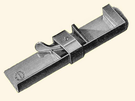
Schiff — galley — a metal tray with raised sides for holding the composed type.
Schmutztitel — half-title (bastard title) — usually placed after the endpaper in books.
Schrenzpapier — a wrapping or packing paper made from waste paper.
Schriftkegel — the type body — the height of the printing face in terms of its extent (the body size).
Schusterjunge — orphan — the opening line of a paragraph left standing as the last line of a page.
Schweizerdegen — "Swiss dagger" — a journeyman who has trained as both compositor and pressman.
Speck — "bacon" — the common term for a piece of easy, profitable work in composing and printing (fat).
Splendid — generously spaced composition, with ample paper margins and heavy leading.
Sperrung — letterspacing — the handling of the s p a c e between letters and words.
Stumpf halten — "setting flush" — beginning a piece of composition with no indent on the first line and closing with a full line (still customary in newspaper work when several compositors set one text under time pressure).
Tenakel — copyholder — a manuscript holder fixed to the type case or the composing machine.
Tertia — 16-point type size.
Text — 20-point type size (English: double pica).
Textura — textura — a gothic (blackletter) type.
Typograph — letterpress printing; a (creative) typesetter/compositor.
Umbruch — making up — assembling the composition, first pulled as galleys, into the correct page size, page order, and so on.
Vakat — a blank page that the compositor must build up from spacing material so the forme is complete when locked up.
Versalien — capitals, as opposed to the Gemeine (lower-case).
Vertaturzeichen — the "turn" correction mark, used to indicate that letters, lines, images or pages are standing upside down.
Vignette — vignette — a small pictorial ornament on the margins, titles and opening pages of printed works, sometimes within the text as well.
Winkelhaken — the composing stick — the compositor's hand gauge (see illustration above).
Zeug — "stuff" — all letters that are damaged, whether on the face or otherwise, and are no longer fit for printing (batter).
Zwiebelfische — "onion fish" — letters that, on distribution, have gone into the wrong type case; also called Fische ("fish").


All rights reserved by Ulrich Krentz.